Tasks
Art Direction, Visual/Brand Identity, Print Design, Responsive Web Design, Design System
Website
www.humanfactors.ca
About the Project
Healthcare Human Factors is a leading agency solving some of healthcare’s biggest problems. Their approach is simple: creating safe, viable solutions backed by iterative user-centered design practice. My role in this rebranding project was defining the voice, and the art direction and designing of the visual identity of the brand system.
My design role included leading and overseeing a team of designers to execute my vision for Healthcare Human Factors brand and design system, creating templates, sourcing, negotiating, and working directly with photography and cinematography vendors to produce new, exciting content.
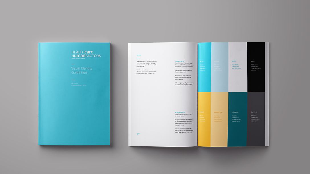
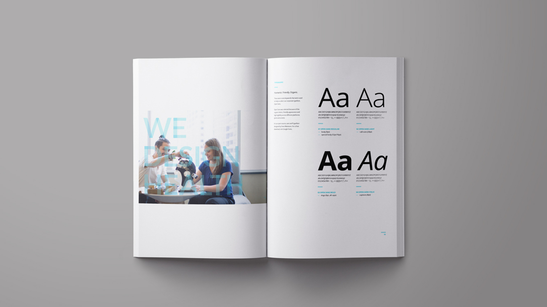
Under my art direction, the new voice for Healthcare Human Factors was welcoming, professional, and human-centric with new photography, typographical, and visual guidelines.
Visual Design + Print Design
LOGO
The logo was designed to represent the two intersections of Healthcare Human Factors: humanistic (with the softer, lowercase words) and scientific (with the rigid, uppercase words) based approaches. These two intersections are very important in the Healthcare Human Factors design principles and a visual representation
While the colour blue is predominantly used in the healthcare industry, I chose a lighter shade for it’s friendliness, warmth, and humanist side. It was important to create a voice that was welcoming, and positive.
COLLATERAL
I designed a clean, minimalist system to help keep messaging and communications clear and efficient. This design system was carried across all collateral including event posters, postcards, proposals, and more.


Responsive Web Design
The newly updated Healthcare Human Factors site was designed to be responsive for all devices, while maintaining the clean, minimalist design system created for the print collateral. Key visual elements from print was migrated successfully to the website to help with hierarchy and visual emphasis.


